HomeOur workContact Us
TNT Creative Studio

Brand identity / Case study

Kukupin

A playful branding system for a pin webshop, built around a soft custom wordmark, bright colour pairings and repeat patterns that make the brand feel collectible, cute and instantly recognisable.

Show more work
Client
Kukupin
Scope
Logo design, colour palette, pattern system, visual direction
Direction
Bold, bubbly, cheerful, webshop-ready
Website
kukupin.shop
Start a project with TNT

Designed by TNT Creative Studio. Scroll to view the final identity, supporting system and early design exploration.

Final Kukupin logo
01 Final logo
Horizontal Kukupin logo in orange and white
02 Horizontal logo colourway
Kukupin logo on green background
03 Alternative lockup
Kukupin logo on pistachio background
04 Bright variation
Dark Kukupin stacked logo on cream background
05 Stacked application
Kukupin orange submark
06 Submark
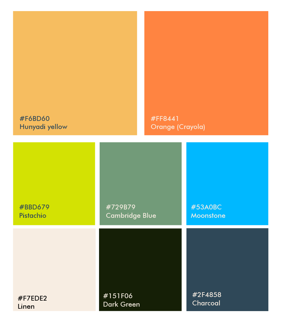
Kukupin brand colour palette
07 Colour palette
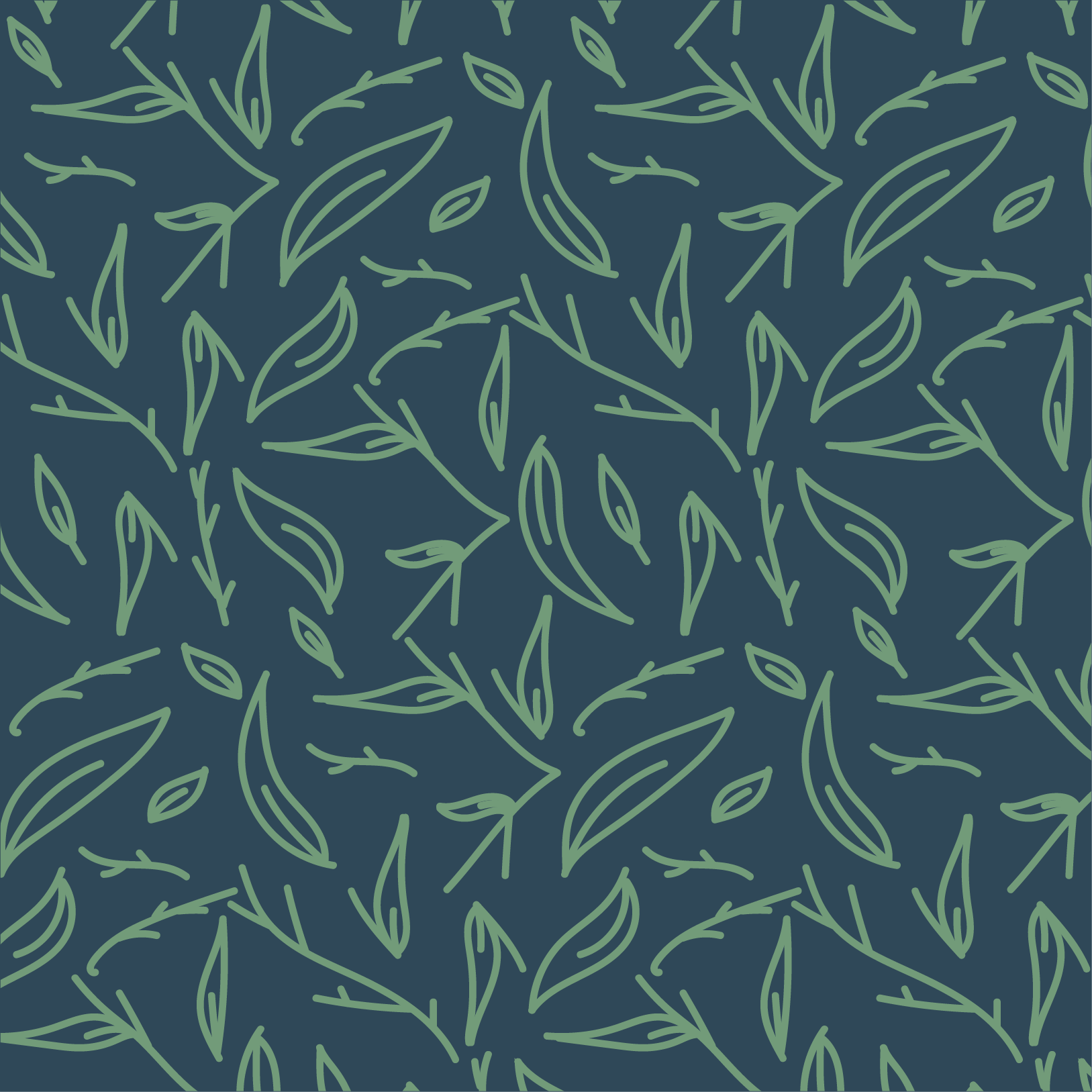
Dark leaf repeat pattern
08 Leaf pattern / dark
Green leaf repeat pattern
09 Leaf pattern / green
Blue sparkle repeat pattern
10 Spark pattern
Orange tropical repeat pattern
11 Tropical pattern
Early Kukupin logo sketches
12 Early sketches
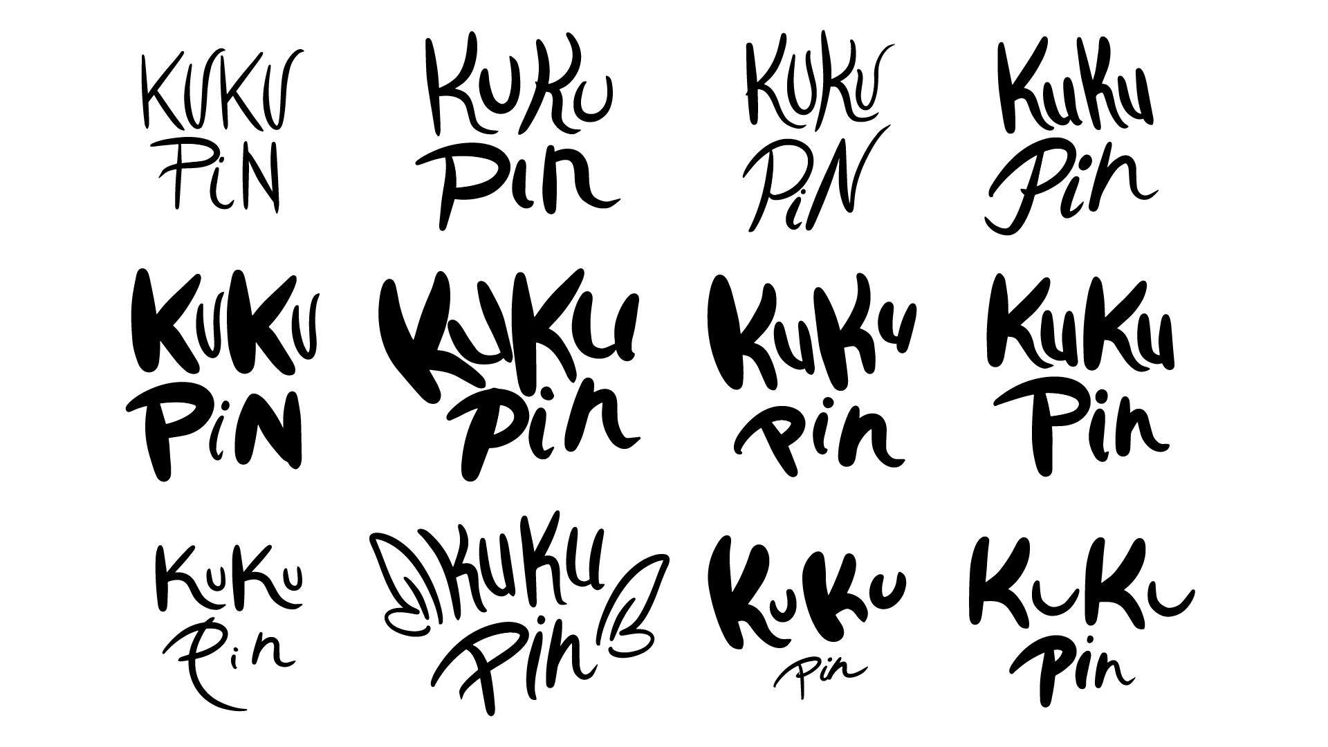
Kukupin hand lettering exploration
13 Lettering studies
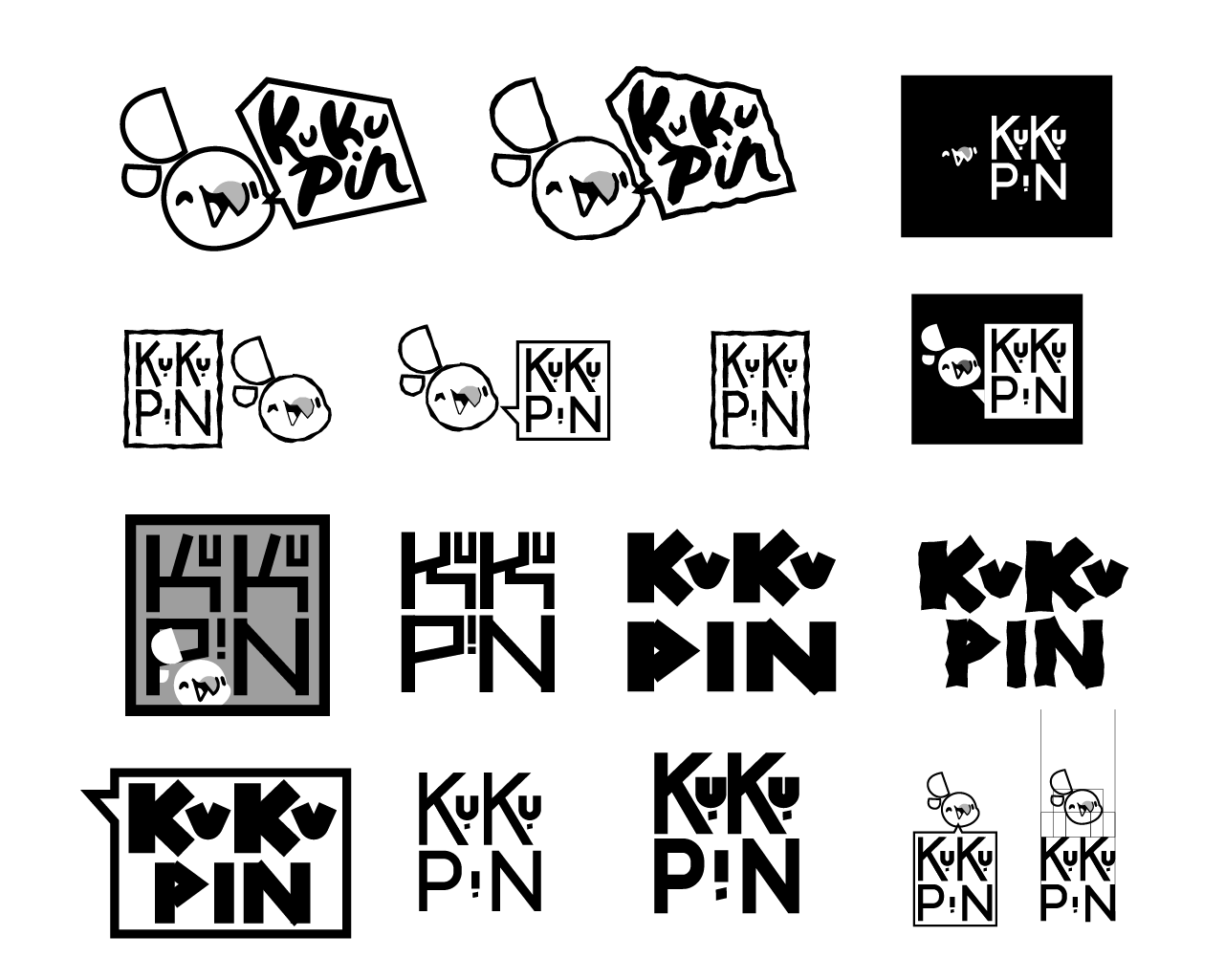
Kukupin logo route exploration
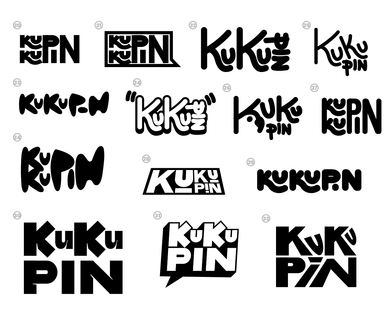
14 Logo exploration
Kukupin refined logo routes
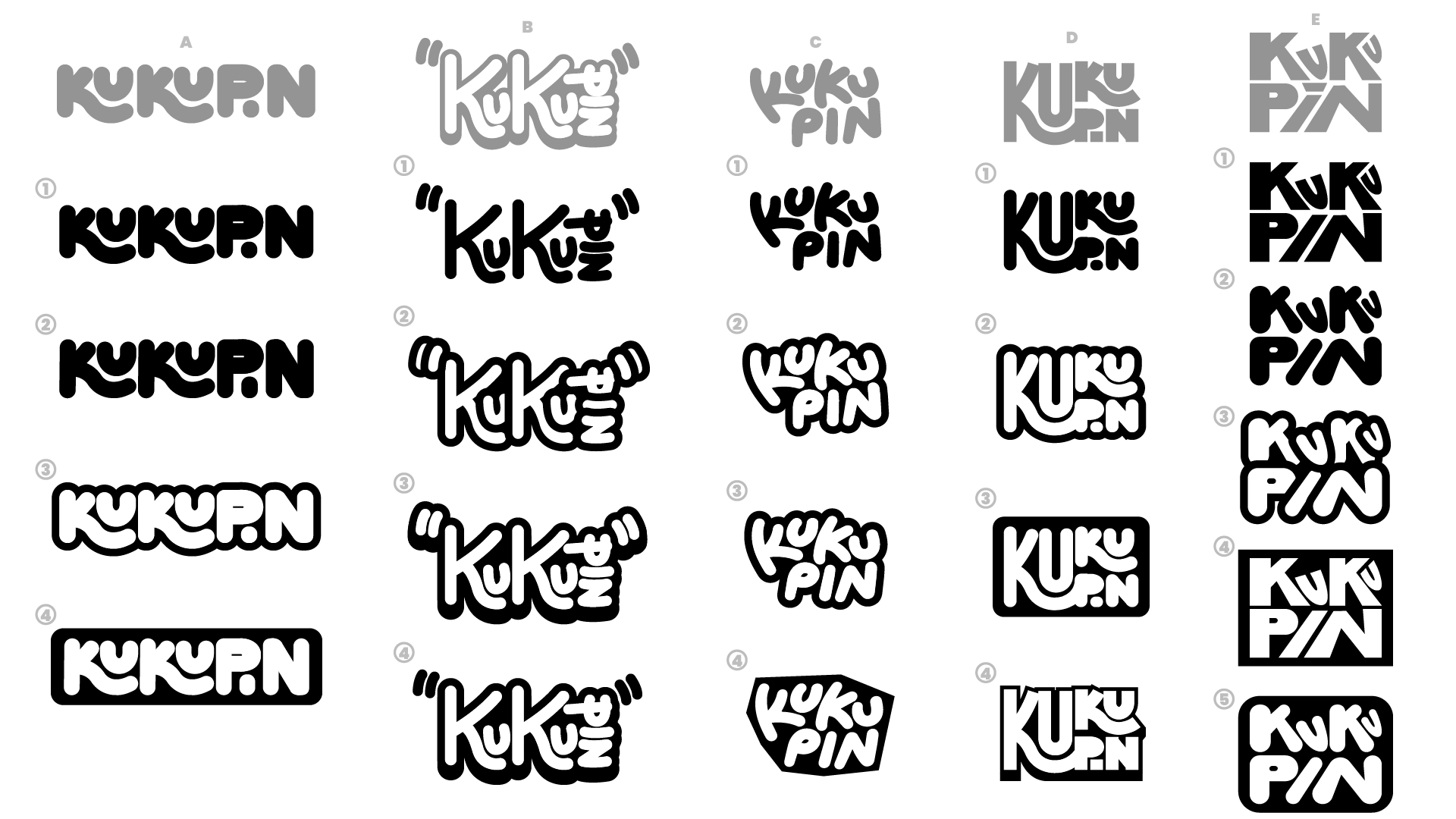
15 Refining the mark