HomeOur workContact Us
TNT Creative Studio

Logo design / Case study

Beam³

A bold logo system for an animation studio, built around dimensional type, cube-inspired marks and a high-contrast black-and-white identity that feels cinematic, sharp and in motion.

Show more work
Client
Beam Cubed / Beam³
Scope
Logo design, symbol system, wordmark, lockups, visual direction
Direction
Dimensional, graphic, bold, animation-studio ready
Website
Coming soon
Start a project with TNT

Designed by TNT Creative Studio. Scroll to view the final Beam Cubed logo system and the exploration that shaped the mark.

Final Beam Cubed combination logo in white
01 Final combination logo
Final horizontal Beam Cubed logo in white
02 Horizontal lockup
Beam Cubed combination logo in black
03 Inverted application
Beam Cubed cube symbol in white
04 Logo symbol
Beam wordmark in white
05 Wordmark
Beam Cubed horizontal logo in black
06 Black lockup
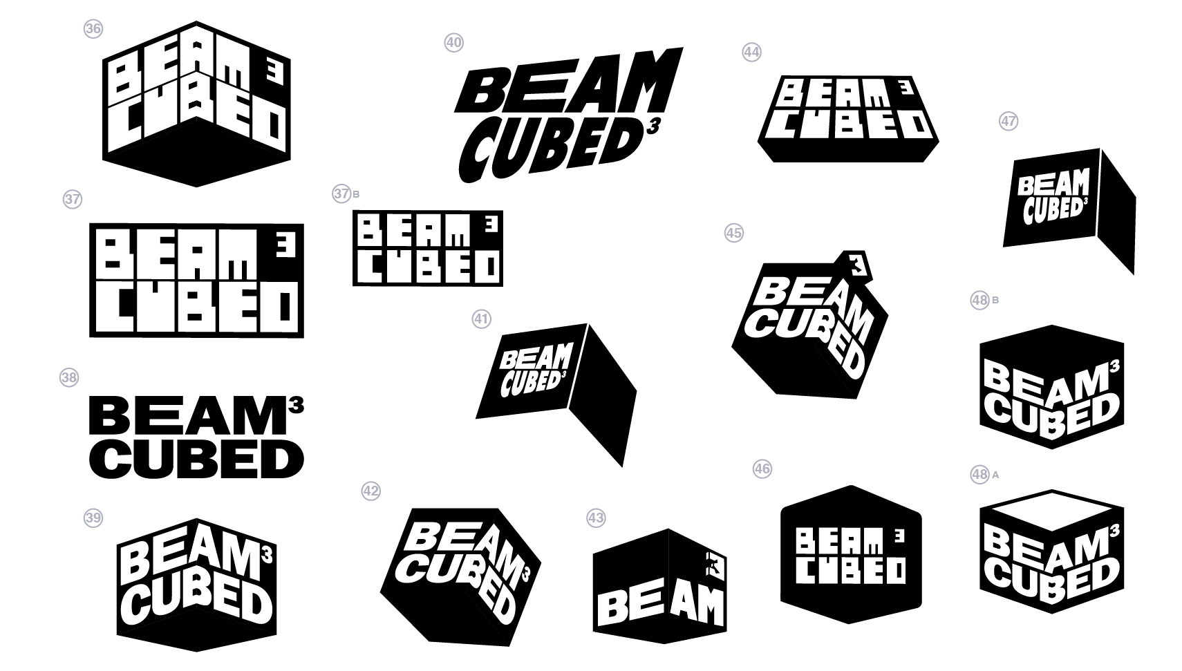
Beam Cubed logo concepts on black
07 Final route selection
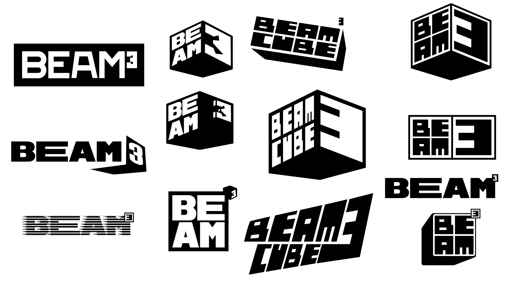
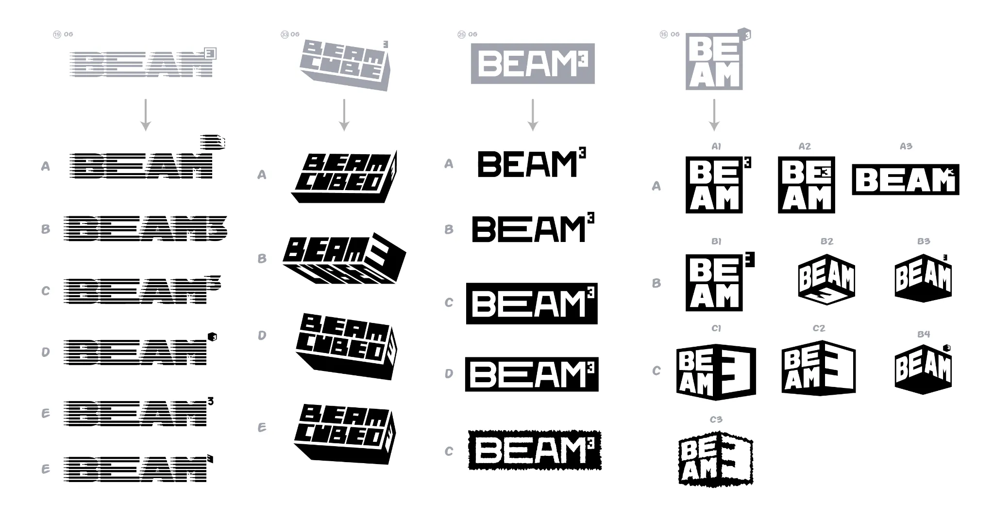
Beam Cubed logo route exploration sheet
08 Route exploration
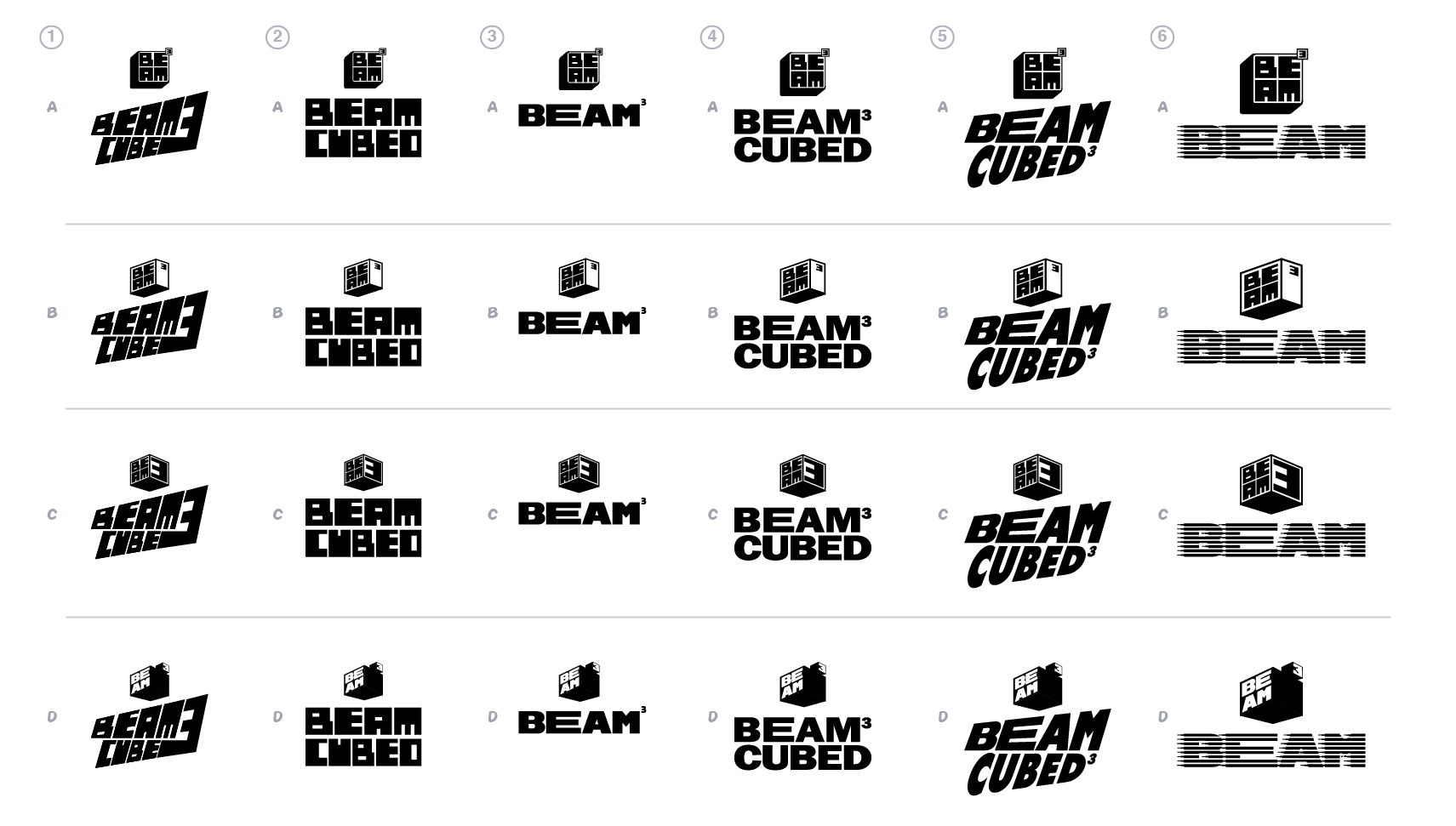
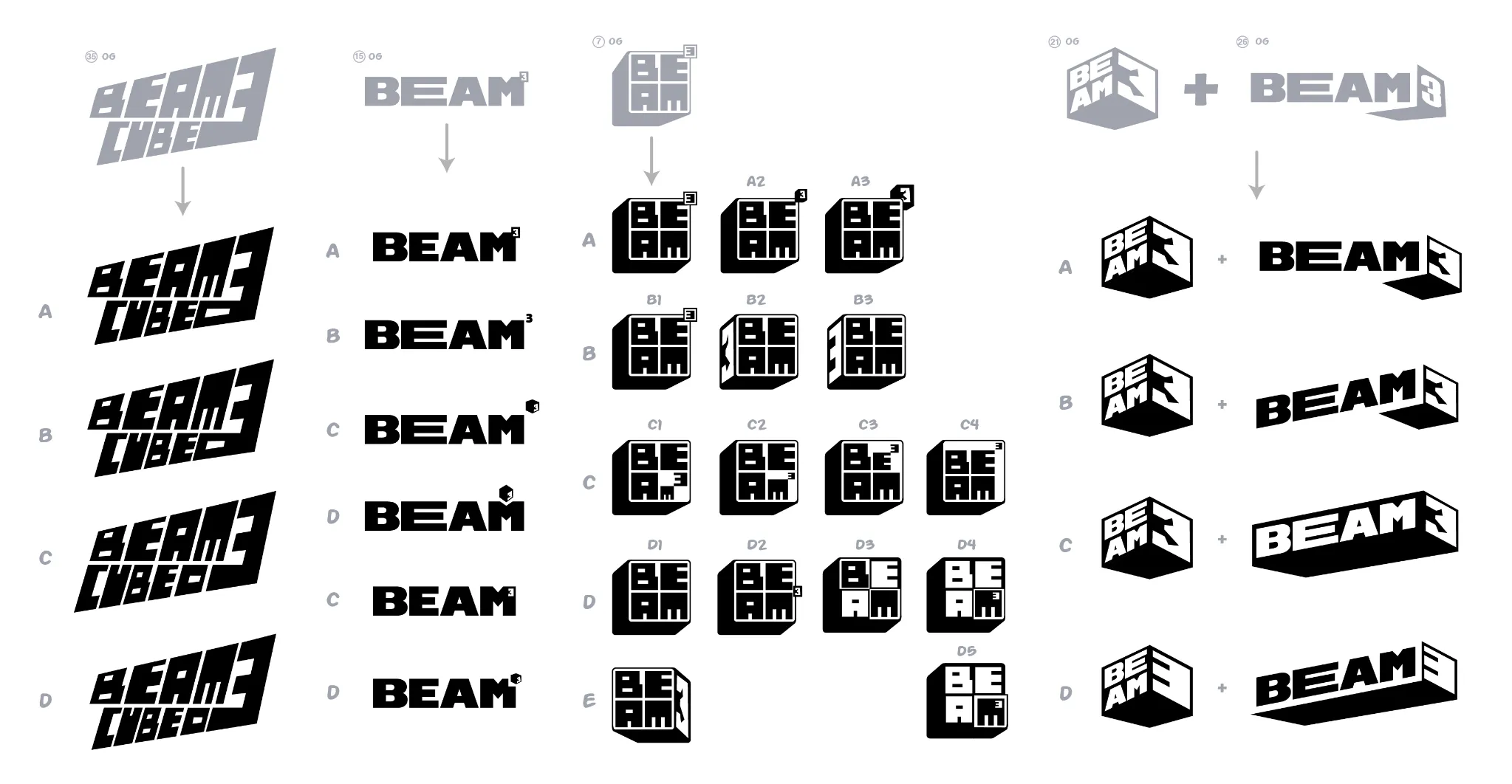
Beam Cubed icon and logo exploration matrix
09 Icon and logo pairing
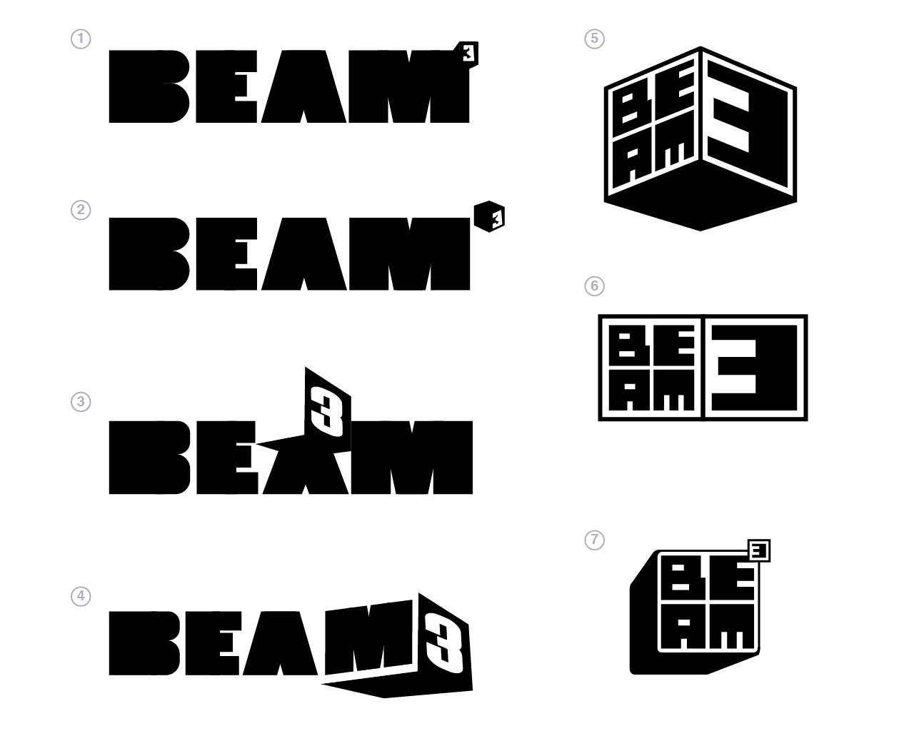
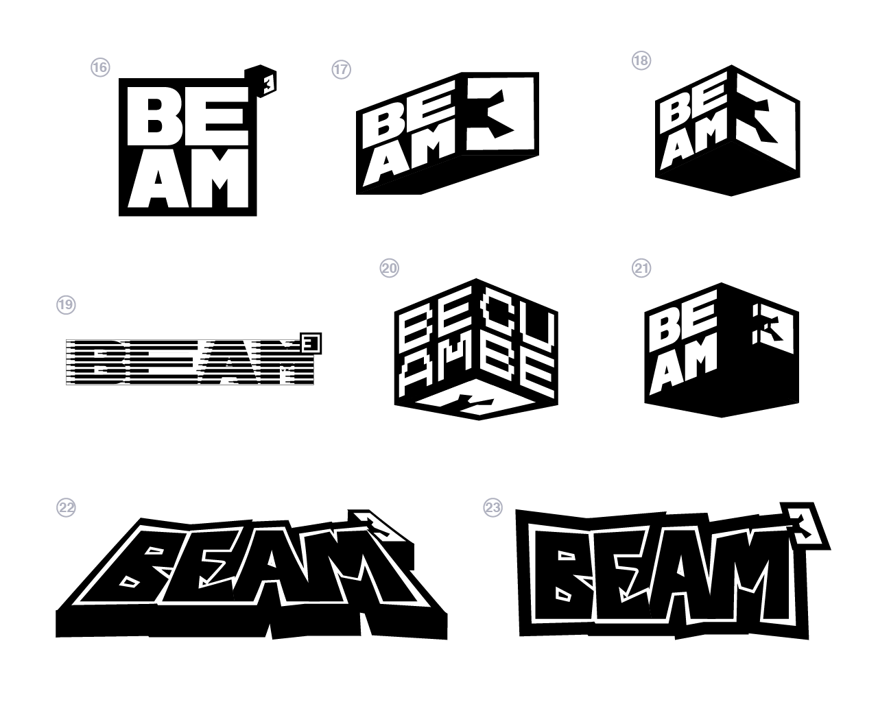
Beam Cubed early logo designs one
10 Early block routes
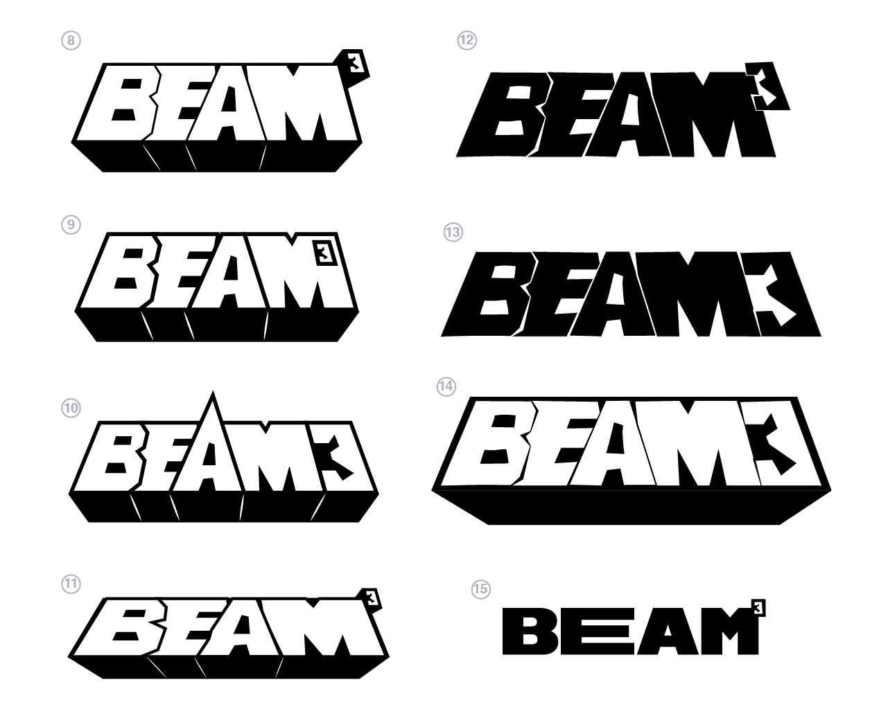
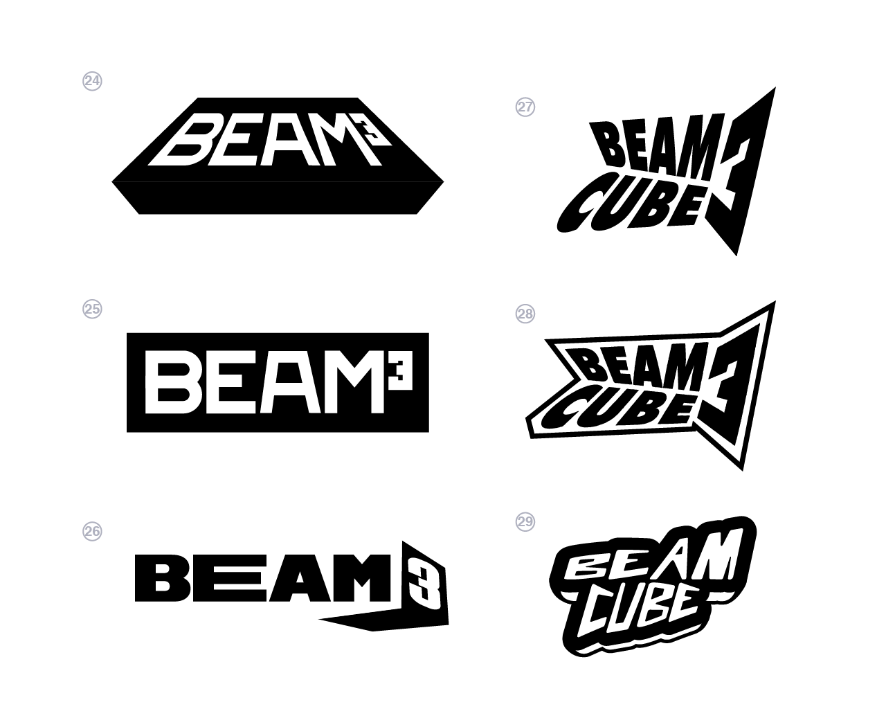
Beam Cubed early logo designs two
11 Dimensional wordmarks
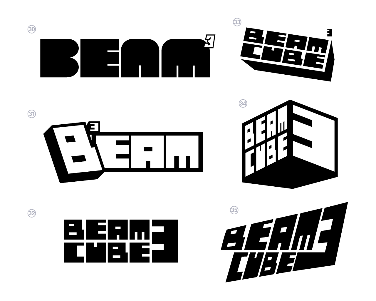
Beam Cubed early logo designs three
12 Cube mark studies
Beam Cubed logo designs three continued
13 Perspective studies
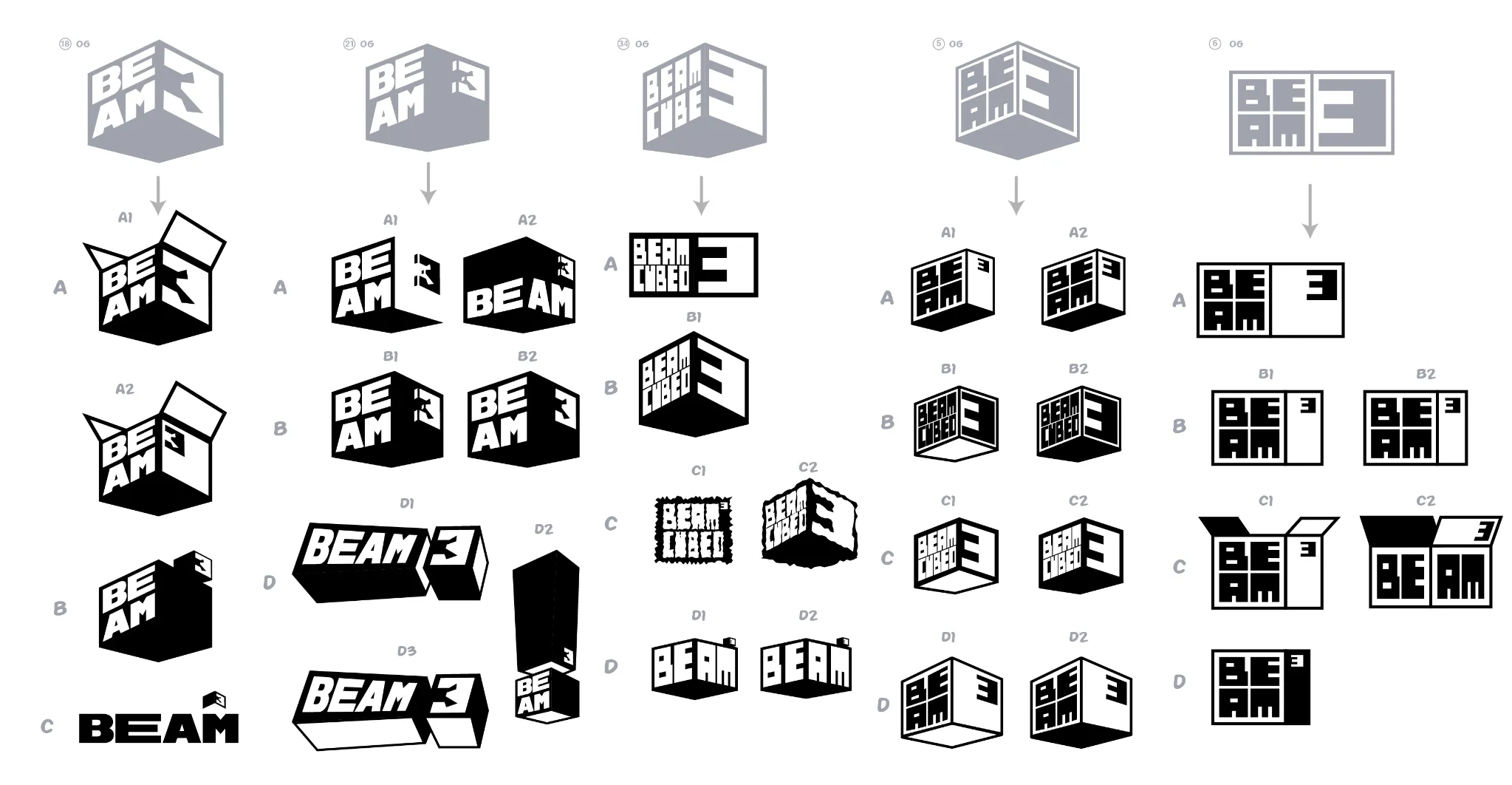
Beam Cubed refinement sheet
14 Refining the symbol
Beam Cubed route development sheet
15 Lockup development
Beam Cubed selected options and revisions
16 Selected options
Beam Cubed final refinement sheet
17 Final refinements